My Three Go-To Paint Colors For Interior Design
One of the most intimidating choices to make when designing a house is selecting paint colors. This decision seems so daunting because it can make or break a whole room. When I first started designing I would do a lot of exploration before selecting a paint color. Which meant, researching what other designers use and having larger paint swatches painted on the jobsite. I assume you are doing your research to avoid a mistake, which is why you are reading this blog!
I have learned a few things over the years about choosing paint that hopefully will help you save you a misstep. Luckily paint is a relatively inexpensive fix, if you do end up making a mistake.
To kick us off, I couldn't help but share what may be my all time favorite office story about paint colors:
“When I was a teenager, lime green was my favorite color. I was convinced it would be my favorite color for eternity (which it obviously wasn’t). My mom let me design my room and I chose to paint my walls lime green. Unfortunately, I didn’t have Denise’s advice yet and I chose a pure bright lime green. It looked perfect on the little swatch but when I got it on the walls it was way brighter than I could have ever imagined. For years, the fluorescent green radiated into the hallways and throughout the whole house.” - Liz Marchant, VP Design
My Three Tried & True Paint Colors
The Perfect Grey - Dunn Edwards Heather DEC773
This color is the perfect blend of taupe and grey. It’s a fresh color that isn’t a trendy cool-grey. It adds warmth to the space and will stay current for years to come. I know it's been a popular color amongst my readers, as we probably receive a question every week on our Houzz page about it!

Bathroom from Sailing & Pailing
The Perfect White - Farrow and Ball Strong White
Friends and family are constantly asking for the "perfect white", and alas, here it is. It has a touch of grey that adds depth to the color but it is a fresh gallery white that will look great in all spaces.
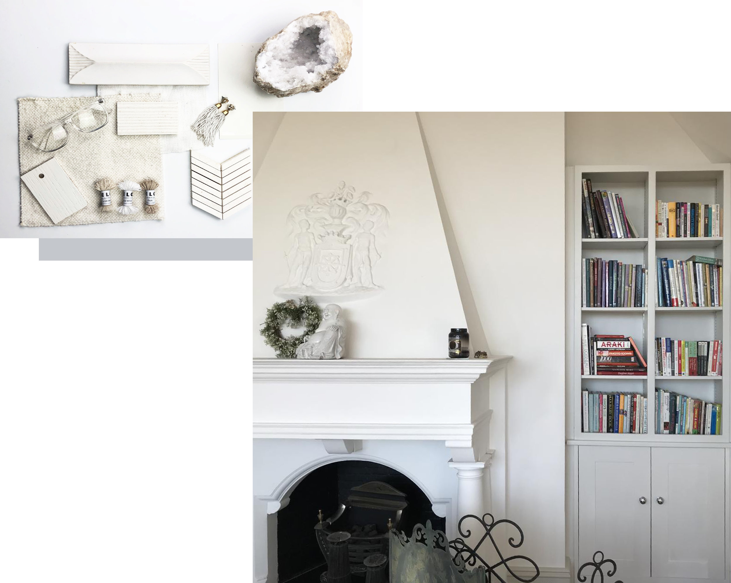
Living Room from Farrow and Ball
The Perfect Accent - Dunn Edwards Charcoal Briquette DET601
I used this color as an accent at my store, House of Morrison, and have never gotten more questions about a paint color. It is the perfect dark accent color that brings out a hip New York City vibe mixed with a casual California undertone.

Hanging Bells & Macrame from House of Morrison
A Few Tips For Selecting Your Paint Color
1. Muddy It Up
My team can attest, the first thing I say when selecting a paint color is to always “muddy” it up a bit. Which means exactly what it sounds like, make sure the color has a little bit of a dirty / brown undertone to it. This will make the color easier to live with long term.
2. Bring Down The Vibrance
When selecting paint colors, remember... a little swatch goes a long way. If I am wanting the result to be the color of the swatch, I will always specify one shade less saturated. Paint always goes on brighter than you expect.
3. Remember The Lighting
Always keep in mind where the paint is going. Lighting will make a huge difference in how the paint feels in the space. If it is for an exterior space, take the swatches outside and see how they look in full sun. If you are painting a powder bath that doesn’t get a lot of light, paint a larger area on the wall in that bathroom to see how the paint interacts with the light (or lack of light) in that space. Remember, even white can feel different in varied lighting.
There you have it! My three go-to paint colors for interior design. I hope this helps you navigate your next paint project. If you still have questions, drop them in the comments below.